I think the finish product is well researched and well put together however I think I still need to look at the finer details within my project and there could be some slight improvements such as testing and checking everything works how it should and everything is saved in the rite format. The things I like about the package are the flyers sunglasses and web banners.
I think there are good points and bad points at each stage of my project but overall I think it needs a few minor improvements.
I think overall the research section was a very strong well planned part of my project and I think I used the criticism, I receive very well and there for it was very useful and effective within the rest of my project. I also think I used the accessibility when creating my website and other parts of my project and I think it was a major factor for me within this project. So overall I think this was a very good part of the project.
I think the working methods of my project were good as the way I used the poster not only for my research but, also as a basis for the whole project I think that was a very effective. I also think that the planning involved with getting my flyers and posters and post cards printed was also very effective. However I think that my testing and checking of my website could have be been improved greatly.
The finished product in conclusion this part of the project was good if it on my computer but as I didn’t test it on other machines so in the presentation the finish product was not as good as I’d have hoped.
Overall I think the project itself was good and it would have been better if I had tested and checked more accurately.
Monday, June 11, 2007
Research-Platform
Platform is a third of the Trent Media organisation. Like the other aspects of Trent media Platform is all about the students. This time I knew of Platform but again I didn’t know it was a part of the Trent Media. I knew it’s existed as I saw it around the halls and the union and the halls and other parts of uni but I had never read t or took much notice of it before. So again I looked into what Platform was involved in and what it actually did. I soon realised again that it was all to do with the students. but they don’t seem to be reading it or getting involved. This could have been the case for a number of reasons, including there advertising structure was not very strong and there wasn’t a lot of info about the magazine out there and within there logos there wasn’t anything to tell people that the three sections within Trent media were connected in anyway for example I knew that want Trent media was but I didn’t no about Trent TV. This is when I found out more about what they did, wrote about and were involved with. I also looked at the material such as there logo and website etc.
After looking at the current material I thought that out of the three logos within Trent media I thought this was the most appropriate logo that were for the product that it was used for so I thought that was good but other than that it was more or less the same as the other 2 in the colours were not very eye catching and they didn’t have much continuity within them all
So after I had looked at all the information I thought about some of the basic ideas that were going around in my head
I cant change the name so it could be something to do with writing and reading
Something to do with platform a stage
Students
Continuity with the Trent media logo
More colour
Something that will attract people of my age
Online
Easy to access to watch online maybe a button on desktop
I also looked at magazines that are out there and local magazines and newspapers
Interactive Narrative
Having scrapped my first few ideas about the interactive narrative i decided to keep it simple and create an interactive narrative about what would happen if you stay in or go out. this mean you would have different outcomes with whatever u click on so for example if u click on the sparkly top then u would go out of if u clicked on magazines or DVDs then u would stay in.
So the first thing i did was to take the photos so i took photos of everything i could think of that you would do if u stayed in and everything if you went out. then i took the images and put them on different pages within deamweaver and linked them together using javascript to make a interactive narrative. the most difficult thing to do within this task was making sure the links linked the correct pages together but other than that it was pretty simple as i had already had a little experience with java script before.
So the first thing i did was to take the photos so i took photos of everything i could think of that you would do if u stayed in and everything if you went out. then i took the images and put them on different pages within deamweaver and linked them together using javascript to make a interactive narrative. the most difficult thing to do within this task was making sure the links linked the correct pages together but other than that it was pretty simple as i had already had a little experience with java script before.
Design Board Presentation
During the ident project i had to create a design board to present my ideas for this project to the tutor and other students
Overall i think it went well and i was pleased but i was given the feedback that i needed to do more research on what people like not just go on wot i liked which was a very fair point and therefore led me to create another questionnaire and do more research so overall it was very successful and useful within my project.
Overall i think it went well and i was pleased but i was given the feedback that i needed to do more research on what people like not just go on wot i liked which was a very fair point and therefore led me to create another questionnaire and do more research so overall it was very successful and useful within my project.
Sunday, June 10, 2007
Identities-Working Method
within the identity package that i created i created a number of different advertising things in order to boost awareness these included:
Poster
Flyer
Postcard
Web banners x2
Website
Sunglasses
Bag
So I started by designing my poster first then I could get an idea for the whole brand I also used this as part of my sample pieces during the research process. So I used this to base the whole package on as I new that the students liked it. I used this to design my flyers and postcards. Evaluating this method of designing it was very useful to me as I designed something very simple such as a poster and used it then to base the rest of the package around. This also helped me keep the continuity within my package.
So after I had done the simple parts of my package I then went on to do the more complex things within this project such as my website and web banner. I started by doing my web banners first because I had a very good idea of what I wanted to do with them as I had just designed my flyers and postcards so I had lots of ideas based on them. Evaluating this process I think this was the simplest but most effective part of the project because the way I managed the project this part of the project was very effective as I had lots of ideas from the flyers, posters and other parts of my package. I also made my web banners very simple and effective as I think it gives more of a statement when on another website.
So the last thing of my package I had to design was my website this was the most difficult and time consuming part of my package. I again based it on the rest of the package for example the colour scheme etc. I started by creating the index page as a base then worked out from there. Evaluating this method it wasn’t a very good method of designing this part of the project as I kept adding pages as a result of working in this way. I started off only thinking I needed 6 or 7 pages and ended up having 15 pages and therefore a lot more last minute work.
Also going back to my research of accessibility I found that when people are using screen readers they need to have very simple websites and all the buttons and things that you add to your web site and also you need to be very clear of what you label and name some of the objects within your site so they can be read by the screen reader then therefore give people with sight difficulties full understanding of what is on your website. So therefore I made sure when creating my website that every object that I added was clearly labelled and that my website was kept very simple. This was a lot more work at the time but I think it is worth it to make it easier with difficulties and disabilities.
Also due to my research I created a CSS style sheet that I could put into my website that would get rid of the colours that are not accessible for people with sight difficulties and replace them with colours that people with these issues would be able to view easily. For me this was a difficult task but I feel is it worth it to enable everyone to view my website. Again I think that I think more web designers should think of these issues when creating websites for major companies.
I think my project was managed well. I did a lot of research early on in the project which meant that I could make informed decisions about the rest of the project so that very useful and effective within the rest of my project. I also insured that things such as printing and other factors within my project were done early to avoid the rush on the day of the deadline. However the last part of my of my project was the website deign and that was not planned very well as I kept adding pages within my website which then meant I was behind schedule. I think was one of my major let downs within this project. Also another thing that let my project down was the fact that because I was behind schedule I could not test my project as well as I had hoped this was a major factor as this lead to my CSS and some other issues not working correctly in time for the last presentation I am working on them all and testing them thoroughly to ensure everything is done correctly.
I think the finish product is well researched and well put together however I think I still need to look at the finer details within my project and there could be some slight improvements such as testing and checking everything works how it should and everything is saved in the rite format. The things I like about the package are the flyers sunglasses and web banners.
External Work
within this year i have tried to push myself to do some external work as i think it is important to build my CV and learn new skills and maybe even earn some money and at the moment I'm doing things that i really enjoy so therefore it is easy for me to work hard at this and do these things in my spare time.
at the moment i have a few projects on the go all for friends and family. i have decided to do this because i think it is a really good way of learning by actually doing that tasks. I'm going them for my friends and family as it gives me a time limited and i can lean lots of skills like working with a client and time management
also at college i built and created an e-commerce website it was really good and contained a bit of everything from css and java script to flash and action script i was very proud of it
First Year in Conclusion
This year in a nutshell has been quite a successful i feel like I've learnt a lot of new skills and used the course as a learning curve for me. i feel like this year i have not only learnt a lot about the life skills i have a lot learnt about time management as well as they are both huge factors of uni life
within the course i have learnt a number of new skills including
animation
action script
AV science
Brain storming
Narrative
interactive narrative
some of the skills and things I've learnt i will take through to next year
Javascript
actionscript
web
flash
advertising
interactive
overall a very good first year
Flash
Within the website that i created within the ident package that i created for trent media i decided that i wanted to put some flash animation on it to make it more interesting and eye catching for the audience .
so i had the idea of makin all the images move or twirl in some way then for this i made the decision that i wanted all the image to roate showing them all one after the other so it would start with the trent media man then going on to platform then trent tv then fly.
so after i decided what i wanted to do then i went on to try and find out how to impliment it so emailed adrian to see if he could help me although i already had some idea of how to do it and how i wanted it to look. i just kinda didnt have the memory or the confidence to just go ahead and it myself.
I arranged to meet adrian one afternoon and he started everything including lots of complex ways of doing apart from the way that i had in mind then we tryed the way i kinda remebered which was to make the image smaller and smaller and doint this gave the illousion that they were twirlin around so he showed me how to do it with one of the images then i had to do it with the other 4 the hardest bit of doin this was making one image disappear and a new image appear in its place.
Accessabilty
During the ident project we looked at accessablity this was a very interesting part of the project for me as i have a disablity myself and have very strong views on equal opppunities for people like me so it was very good for me to learn more about things such as the disability discrimination act. i also have a friend with sight difficulties so i have had previous nowledge of screen readers and so on
so when we were lookin at the websites given as examples for the discinmation it opened my eyes alot as i had never thought of all the details when making a website accessable for everyone to use. simple things like not being able to use a mouse became so so difficult to access certain websites
when looking into this i became aware of how many websites just dont think about making there websites more accessable and this then made me more determind to put this into my website
Research-Sunglasses Theme
From lookin at all of my current research into Trent Media and everything i have come up with the idea of a sunglasses theme thoughout the three aspects of trent media. this will give the continuity thoughout that im looking for and that i think is needed to give trent media the boost it needs in order to get more people involved .

the sunglasses theme means i can keep the trent media orginal logo

so from this i decided to create a differernt pair of sunglasses for each section within trent meid so for this i started to think about how i would make each pair different but the same, (same but differernt ooooooooooo that rings a bell)
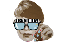
For Trent TV i thought
square eyes
square glasses
name trent TV above
star in right corner to keep continuity
square eyes
square glasses
name trent TV above
star in right corner to keep continuity
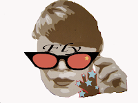
For Fly radio i thought
edna everage
sunglasses with wings
glitter and sparkles
name at top of glasses
star in right corner to keep continuity
star in right corner to keep continuity
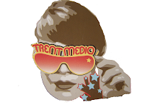
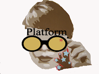
For Platform
serious
reading glasses
smaller
name at the top
star in top right corner to keep continuity
This is the finish product from my ideas


Research-Trent TV
Trent TV Trent TV is a third of the Trent Media organisation. Like the other aspects of Trent media Trent TV is all about the students. A camera man/crew go along to certain Tent events and film what is going on they film the fresher’s week, kinky and other sports and dance events going on at the university. This time I knew of Trent TV but the only thing I new about it was that they came to our dinning room first thing in the morn one day within the fresher’s week and asked to film us. So I knew it’s existed but I didn’t know where it was or anything else about it really. So again I looked into what Trent TV was involved in and what it actually did. This could have been the case for a number of reasons, including there advertising structure was not very strong and there wasn’t a lot of info about the radio station out there and within there logos there wasn’t anything to tell people that the three sections within Trent media were connected in anyway for example I knew that want Trent media was but I didn’t no about the radio station on the Trent TV, I just thought it was all about the magazine. This is when I found out more about what they film and get involved with. I also looked at the material such as there logo and website etc.
After looking at the current material I thought that out of the three logos within Trent media I thought this was the most appropriate logo that were for the product that it was used for so I thought that was good but other than that it was more or less the same as the other 2 in the colours were not very eye catching and they didn’t have much continuity within them all
So after I had looked at all the information I thought about some of the basic ideas that were going around in my head
I cant change the name so it could be something to do with TV
Something to do with square eyes
Students
Continuity with the Trent media logo
More colour
Something that will attract people of my age
Online
Easy to access to watch online maybe a button on desktop
Tv online is becoming more and more popular with the new channel 4 stations online called 4 on Demand
Also through things like www.alluc.org where you can stream TV programs off the net and watch them when you like.
Next Year Options
Wow a year has nearly gone and we've given the options for next year! this is really strange as it feels like we havent been here a year and havent done anything to worrent a hole year
So these are the options for next year
Audiovisual
Web Design
Games Design
Interactives
Animation
This is a really hard choice as we havent really had much experience with all the differnt areas but they did give us lots of information about each setcion adn what they involved and also gave us lots of information about the future job prospects within each area. which i thought was a very good way in which for us to make a good choice.
So i really looked into this in order to make a valid decision so i looked at all the jobs available and havin looked at all the options i then kinda had an idea in my head of what i wanted to do and then i had a very informative chat to my tutor simon about the choices and told him that i either wanted to do audiovisual or web design. he told be that web design wud be very hard work now and audio wisual wud be hard work in the future at first i didnt have a clue what he was on about. then he told me that webdesign was hard work whilst your learning it but there is alot of work available and career prospects within this option. whereas audiovisual was easier now but it is a very hard industry to get into and there isnt alot of jobs of available. so then that was it i had made my mind up and i was going to do web design. so thanx to that 10min chat from simon i was all sorted it just clicked in my head it was that little bit of an extra push i needed to make my mind up.
Laura Knight-Performance
Within the task i was a clown and this involved me wear a clown outfit and trying to juggle and i really enjoyed it and overall it went really well and it was very well organised. i think we all came together and work well overall. it was better than some of the other group work i had been involved with. the feedback we received was also positive.
Laura Knight-The Group
Our group for this project is
Hannah Berry
Eriko Hamada
Anup Sohol
Nicola Spencer
we got to together on a number occasions to meet and discuss what we indented to create for this project. we got together and did research and went shopping for costumes. for the majority of time we worked really well as team as Hannah berry apposed herself as the team leader and kind of kept everybody in contact with each other and therefore kept us all organised which worked really well.
Within the performace we were each given a part these included
Hannah Berry teacher/narrator
Eriko Hamada Ballerina
Anup Sohol Army man
Nicola Spencer Paint/Narrator
Hannah Leatherday Clown
Laura Knight-Live Art
We had been given a last group project and it was all to do with art and exibihtions so of course Dominic Shaw had something to do with it.
so what he had to do we were given the task to perform a piece of live art about a famous person form nottingham, we were put inot groups of 5ish then were given the nme of a famous person we had to research and then perform a piece of live art. there was alot of issues and enphisis on the "live art performance" as no one really new what we had to do or what a live art performance involves. so we just went for it and just did whatever our interpertation of this.
we were given the name Laura Knight and havin done some research on this we came to the conculsion that she was a famous artist who studied at the university wen it was a art college many years ago. we decided to do a performance and bring each of her paintings and bring them to life.
Laura Knight-Research
English painter and designer. She studied at Nottingham College of Art from 1889. In 1894 the deaths of her mother and grandmother left her dependent on her own earnings, and she taught art from a studio in the Castle Rooms, Nottingham. From 1903 she exhibited regularly at the Royal Academy, London, and in the same year married the painter Harold Knight (1874–1961); they lived in an artists' community in Staithes, north Yorkshire, until 1907, also spending time in another community in Laren, Netherlands. They then moved to Newlyn, Cornwall, attracted by the presence of a number of prominent artists. The couple exhibited together at the Leicester Galleries, London, in 1912. Although Knight painted various subjects, her reputation was founded on paintings of the ballet and the circus, which became predominant after she moved to London. Technically of a high standard, her narrative realist works were painted in bright colours and have limited depth of expression (e.g. Ballet, 1936; Port Sunlight, Lady Lever A.G.). She painted backstage during the Diaghilev ballet's seasons in London and took lessons at Tillers Dancing Academy in St Martin's Lane in order to draw there; she also travelled with the Mills and Carmos Circus. In the 1930s she started painting horses and gypsies at the races, as in Gypsy (1938–9; London, Tate). An accomplished portrait painter, she painted wartime commissions and was the official artist at the Nuremberg War-crime Trials. She also did etchings (e.g. Some Holiday, aquatint 1925; see Fox, p. 60) and executed designs for stained-glass windows
Dame Laura Knight was a leading artist in the first half of the twentieth century. She also became the first woman artist to be elected into the Royal Academy since the first female members Angelica Kauffmann and Mary Moser. During her lifetime, she was praised for her lively scenes of the circus and the baler but she now receives more praise for her landscapes. Knight served as an Official War Artist during World War II and she also traveled to Nuremberg in 1946 to record the War Criminals’ Trial.
Laura Johnson was born in Long Eaton in 1877. She studied art in Nottingham and while there married the portrait painter, Harold Knight (1874-1961). Knight produced a long series of oil paintings of the ballet, the circus and gipsy life. Knight established herself as the most important woman artist in Britain and in 1936 became the first woman to be elected to the Royal Academy since 1760. During the Second World War Knight became an official war artist and was sent to cover the Nuremberg War Crimes Trials. In later life she concentrated on watercolour landscapes. Laura Knight died in 1970.

Same But Diffferent
I think that the same but different project was the worst project of the year. I didn't understand what the whole project was about right from start.
From the first lecture that we had about cataloguing i and understood that we were given the task to get into groups of 3-5 and take photos of the same object but in different environments and surroundings. then having done this then we had to catalogue them in some way
this seemed like a very simple task but as we had more lectures and more information bout cataloguing the more confused i became. then i put myself in a group of me Sage and Sophie and that didn't really work either as they didn't want to really get involved with the task so the motivation and enthusiasm wasn't there from the start really
then 2 more people where added to our group as Sophie failed to turn up to the lectures with the pictures she claimed to have taken.
so the new group and i decided that we would take photos of cigarette buds which is not the best thing to take photos really but it would have had a good story behind it. this was we wanted to find out if there were different cig buds in the different class places around Nottingham. so we started off in the arboretum park and the city centre then went to the lower class areas of Nottingham including st Ann's and Radford.
this would have been a really good idea if people had been willing to put the effort in more and there was a little bit more enthusiasm and motivation as there was lot of good ideas behind this project but it just didn't work.
Animation
I think the animation section of this course was one of the best bits that I've don't this year and i have really enjoyed it. I thought when we first started that i was going to struggle with it and that i would get left behind and not be able to catch up. so in a way this made me quite scared but excited to do the animation if I'm really honest.
The first class was really getting to grips with the software used to animate then from this it settled my mind because it was much simpler that i thought. also the way in which is was taught helped too as Andy Love showed us on the projector first wot to do and where everything was within the software so after we had watched him do the task then we where given the instruction on a sheet to work through this was good as we only had a hour within the seminar so this meant we could then keep the sheet and use it too work on it after the seminar or maybe even use the sheet to work on future tasks. the first task was making bouncing words this was simple and allowed us to get to grips with all the tools within the software.
Then we learnt splines and lines from learning about this we could then create something as complex as an octopus with all the 8 tentacles which could be controlled using very few commands and controls which i thought was really good. this made me look into the world of animation and i now now how all the animation movies can be made very simply with the right software.
Then we learnt about Editable poly's and vertex and extrude and bevel parts of objects these skills then meant we could make a figure that was a very simple person which mean we were gaining more skills and more incite into animation and how it all is made and how simple or complex it can be.
Then came the most difficult and complex but interesting part of animation bones and skins from learning theses skills we learnt how to make the body and person move like a person we started with the leg and i was amazed at how easy it was to make something that looked so effective. this also shows me how it is done in the industry as i thought it was done using these light reflecting things that are stuck on peoples body to show there working pattern and how they move certain parts of the body when doing certain things. i now all about this as it is used for me in the hospital to show the doctors the way that i walk. so i asked Andy bout this and he told me that it still used for more complex things but this way it a lot cheaper and probably just as effective. he also told me if i could get hold of my images of my walking pattern them i would be able to make the legs move like my walking pattern but to be honest if i saw would my walking pattern actually looked like id be angry so as much as it would be very interesting its not the best idea!
Identities Evaluation Report
Identity Report
In this report I am going to evaluate each section of the working process the identity project. I am going to evaluate each section thoroughly to see the process of each stage and the strengths and weaknesses within the project. These stages will include research, working method, project management and final product. I will look at each of these stages then evaluate them all within a conclusion.
Within this project we have been given a brief containing three options of brands and companies to design a new corporate identity for them. This would then hopefully improve there advertising strategy then therefore bring more attention from the public in there certain areas. Out of the three options I had been given I chose Trent Media and for their new corporate identity package I would then design and produce various means of advertising including a website, web banner, postcard, flyer, posters, bag and a pair of sunglasses.
Research
After I had chosen which option I was going to work with I then went onto research for this I looked at the current structure of the Trent Media package. When doing this I found that that current package lacked continuity throughout the three aspects within Trent Media. So this was one of the main aspects that I focused on when designing the new package having done the research on the current package, so therefore I think this part of my research was very effective as within the package that I have created. As I have used the main Trent media image and kept a theme of sunglasses throughout to show that the three different media aspects are linked within one organisation that is Trent media.
After the first design board presentation I was asked about my research about why I had chosen the sunglasses theme and I was given advice to look at this more closely and look at not just what I thought looked nice but also what the students thought as well so I came up with a few sample pieces and ideas and asked students what they thought about it and I had a good response so decided to stick with the sunglasses theme. However I think that this part of my research process was very useful to my design process as it gave me a better idea of what the students like and what would be effective and useful within the package. (see fig. 7)
Also within my research I also wanted to find out how the old structure worked before what I could take from it to improve it. So I made a questionnaire and asked students the questions such as What is Trent Media? and Where can u access Trent Media? From this I found that not a lot of student new about Trent Media using its current package. This research process was also very useful when designing my new package.
Also within the research process I looked at accessibility of websites. Within is part of my research I looked at various issues such as colour-blindness and hand eye coordination issues as well as other issues people who access the internet may have. During this research process I found that there are many websites that cannot be accessed easily by people with disabilities and other sight difficulties. This research was very effective as it made me aware about such issues as the number of buttons and flash animation and about the colour schemes and size of text I chose when creating my website then this lead to me making my CSS style sheet for my website that would make my website more accessible for people with disabilities and other sight difficulties
Working Method
Within this new package I created I designed and made a website, web banner, poster, postcard, flyer, sunglasses and bag
From my research I found that there were parts of the current package that I could keep such as the bag as it had the Trent media logo that I wanted to keep. I decided to keep the Trent Media logo as it tided in with my sunglasses theme and it is the main logo used so I thought that if I worked with what the students already new therefore it’s still partly known by the students and therefore I could then focus on the other issues I found within my research.
So I started by designing my poster first then I could get an idea for the whole brand I also used this as part of my sample pieces during the research process. So I used this to base the whole package on as I new that the students liked it. I used this to design my flyers and postcards. Evaluating this method of designing it was very useful to me as I designed something very simple such as a poster and used it then to base the rest of the package around. This also helped me keep the continuity within my package.
So after I had done the simple parts of my package I then went on to do the more complex things within this project such as my website and web banner. I started by doing my web banners first because I had a very good idea of what I wanted to do with them as I had just designed my flyers and postcards so I had lots of ideas based on them. Evaluating this process I think this was the simplest but most effective part of the project because the way I managed the project this part of the project was very effective as I had lots of ideas from the flyers, posters and other parts of my package. I also made my web banners very simple and effective as I think it gives more of a statement when on another website.
So the last thing of my package I had to design was my website this was the most difficult and time consuming part of my package. I again based it on the rest of the package for example the colour scheme etc. I started by creating the index page as a base then worked out from there. Evaluating this method it wasn’t a very good method of designing this part of the project as I kept adding pages as a result of working in this way. I started off only thinking I needed 6 or 7 pages and ended up having 15 pages and therefore a lot more last minute work.
Also going back to my research of accessibility I found that when people are using screen readers they need to have very simple websites and all the buttons and things that you add to your web site and also you need to be very clear of what you label and name some of the objects within your site so they can be read by the screen reader then therefore give people with sight difficulties full understanding of what is on your website. So therefore I made sure when creating my website that every object that I added was clearly labelled and that my website was kept very simple. This was a lot more work at the time but I think it is worth it to make it easier with difficulties and disabilities.
Also due to my research I created a CSS style sheet that I could put into my website that would get rid of the colours that are not accessible for people with sight difficulties and replace them with colours that people with these issues would be able to view easily. For me this was a difficult task but I feel is it worth it to enable everyone to view my website. Again I think that I think more web designers should think of these issues when creating websites for major companies.
Project Management
I think my project was managed well. I did a lot of research early on in the project which meant that I could make informed decisions about the rest of the project so that very useful and effective within the rest of my project. I also insured that things such as printing and other factors within my project were done early to avoid the rush on the day of the deadline. However the last part of my of my project was the website deign and that was not planned very well as I kept adding pages within my website which then meant I was behind schedule. I think was one of my major let downs within this project. Also another thing that let my project down was the fact that because I was behind schedule I could not test my project as well as I had hoped this was a major factor as this lead to my CSS and some other issues not working correctly in time for the last presentation I am working on them all and testing them thoroughly to ensure everything is done correctly.
Finished Product
I think the finish product is well researched and well put together however I think I still need to look at the finer details within my project and there could be some slight improvements such as testing and checking everything works how it should and everything is saved in the rite format. The things I like about the package are the flyers sunglasses and web banners.
Conclusion
I think there are good points and bad points at each stage of my project but overall I think it needs a few minor improvements.
I think overall the research section was a very strong well planned part of my project and I think I used the criticism, I receive very well and there for it was very useful and effective within the rest of my project. I also think I used the accessibility when creating my website and other parts of my project and I think it was a major factor for me within this project. So overall I think this was a very good part of the project.
I think the working methods of my project were good as the way I used the poster not only for my research but, also as a basis for the whole project I think that was a very effective. I also think that the planning involved with getting my flyers and posters and post cards printed was also very effective. However I think that my testing and checking of my website could have be been improved greatly.
The finished product in conclusion this part of the project was good if it on my computer but as I didn’t test it on other machines so in the presentation the finish product was not as good as I’d have hoped.
Overall I think the project itself was good and it would have been better if I had tested and checked more accurately.
Thursday, June 07, 2007
Research-Fly
Within the Trent media organisation there is a section called Fly. Fly is a radio station within Trent media. So when I was told abut this again I looked into it further as I had not heard of it before, so I looked into there current material this included things like there logo and things within there advertising structures including flyers and things then I thought about why I hadn’t already heard of this before. This could have been the case for a number of reasons, including there advertising structure was not very strong and there wasn’t a lot of info about the radio station out there and within there logos there wasn’t anything to tell people that the three sections within Trent media were connected in anyway for example I knew that want Trent media was but I didn’t no about the radio station on the Trent TV, I just thought it was all about the magazine. Also one other big factors with the radio station at the time of the project is that it only played at certain times for a very short length of time within the public places within the university campus which I thought was very poor as that is what is it all meant to be about the radio is free information and music for the public. However it can be listened to online in places like the library. So I thought this was something that definitely needs to improve on.
http://www.trentstudents.org/club_homepage.asp?clubid=8790
So after I had looked at all the information I thought about some of the basic ideas that were going around in my head
I cant change the name so it could be something to do with wings
Or fly like the way gangsters say it like to describe something good
It’s a radio so its got to have some kind of music
Continuity with the Trent media logo
More colour
Something that will attract people of my age
Online
Easy to access to listen online maybe a button on desktop
Maybe have podcasts for people to download
Then I looked at other local radio stations websites and radio stations that I listen to and looked at there advertising structures and packages
I looked at the galaxy website and other things within there package as it is my local radio station at home in Yorkshire and its ace and it is aimed around that same age range that fly is.
Galaxy plays on all the different forms of media including online, digital radio freeview and sky and virgin media as well as good old FM radio on 105 in the Yorkshire Area.
Looking at this package I found that it was a very good package but that’s what you would expect from quite a large organisation like galaxy. There website has lots going on and uses a lot of colour this attracts I like the coloured scroll down boxes within the menus at the top these are good as not only are they very eye catching but it is good for the audience as it keeps things in some kind of colour coded structure within the website.
Galaxy also has a package including screen savers, wallpapers, car stickers, posters act which all contain the same colour scheme and logo. even the other area within the radio station including “Hirsty’s Daily Dose” show also stick to same logo and colour scheme within there posters and stickers etc.
I also looked other local stations around this area. I looked at Trent FM
Unlike Galaxy radio Trent FM is based on a larger age rang and therefore plays a larger variety of music to accommodate these people.
It also has a website that is very simple and effective it uses the same colour scheme throughout. it is very standard for a website for a radio station but in a good way, as this radio station is based on a lot more people from a larger age range so they are keeling it simpler to accommodate all those people where as galaxy is based on a a younger and smaller target audience. it is simple uses a lot of colour and had all the information needed for promote the radio station.
www.trentfm.co.uk
So looking at these radio stations and there material I think this is what Fly radio could be/have
Good strong logo
Lots of colour
Good website
More interaction with the audience
Tuesday, June 05, 2007
Research-Brain Storm
From looking at the current material and the info about the three options i then came to the decision that i was going to work with the Trent Media package during this project. i chose this option becuase i thought that was alot of possible improvements for it and i think i could use alot of colour and i had alot of ideas about the project and the package. so i decided to brainstorm my ideas to make them in some kind of order. this method was very gud as it gave me a very clear idea of what i wanted to do within this project.


From this i then decided i wanted to i decided i wanted a sunglasses theme as sunglasses were already used within the trent media logo so i thought ppl will already know that logo so it would therefore help me within my package.

I also wanted to bring some contiuity within this package as i think it it very important within Trent media as it contains 3 different media options within it in, it contains Fly Radio, Trent TV and Platform Magazine. so i thought i could encourporate the three options using differnt sunglasses this means that they will still have there own logo but all have there differences in some way. this means that people will know that trent media involves all three media aspects including Fly Radio Trent TV and Platform magazine.
Subscribe to:
Posts (Atom)