ALT tag
Definition
HTML tag that provides alternative text when non-textual elements, typically images, cannot be displayed.
Information
ALT Tags are commonly omitted from web pages, from the smallest personal pages to the largest web corporate sites. Yet, if properly used, ALT Tags can be quite useful. Among other things, ALT tags can:
* provide further detail for an image or the destination of a hyperlinked image.
* enable and enhance access for people with various disabilities.
* provide much-needed information for people who surf the Web with graphics turned off, and people who surf the Web with text-only browsers.
* assist in navigation when a graphics-intensive site is being viewed over a slow connection, enabling site visitors to make navigation choices before graphics are fully rendered.
http://www.marketingterms.com/dictionary/alt_tag/
Tuesday, April 28, 2009

Monday, April 27, 2009
web design website examples
Continuing with the Accessibility vs Design Blog i thought id have a look at some of the accessibility websites to look at how they get the balance between design and accessibility.
After looking at a number of different examples of different accessibility websites and they seem to prove what i already thought that design and accessibility doesn't seem to mix.
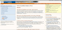
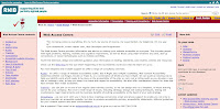
All of the websites I have found seem to have the same simple design examples of which are shown below:
After looking at a number of different examples of different accessibility websites and they seem to prove what i already thought that design and accessibility doesn't seem to mix.
All of the websites I have found seem to have the same simple design examples of which are shown below:


Wednesday, April 22, 2009
Artifact Refresher
So its been the easter holidays and all everyone has been focusing on is the client project. Now thats all over and done with its time to get bak on with the gud old research project.
looking at the last one i did and the feedback i received from tutors and my peers i had the idea that i would look at design vs accessibility on the web. this however could lead to me opening a can of worms as they say as this is such a huge issue in the web world. this would be a very good issue to look into however i am unsure if it fits into the question
How effective are various accessibility methods and techniques used in WEB site design?
looking at the last one i did and the feedback i received from tutors and my peers i had the idea that i would look at design vs accessibility on the web. this however could lead to me opening a can of worms as they say as this is such a huge issue in the web world. this would be a very good issue to look into however i am unsure if it fits into the question
How effective are various accessibility methods and techniques used in WEB site design?
Thursday, April 09, 2009
Sunday, March 15, 2009
SPP3 Showreel Example
Artifact 4 What I did
So as part of the final section of the research project we have created a number of artifacts, for my forth artifact i have looked at layout as part of the accessibility features i have been looking at as part of my research. for this i started by removing the table that was holding all of the content within my test site. this was a huge step to making my test site as accessibile as possible, as this allowed users with screen readers to view content instead of just reading the number of coloumns and rows in the table. this was a very successful step as i tested it using a screen reader to ensure that all of the content could be read. The next thing i did was to then look at different layouts and decide which was the most accessible i decided that the most accessible layout would be the most accessible layout for my test site. after looking at different accessiblity tips regarding layout i decided to put all of the important content within my site to the top then the lesser important content at the bottom. this would ensure that the important information can be access first when entering the site.
Golden Rules Accessibility vs Design
1. Accessibility is no longer optional.
There’s been plenty written on the motivations for accessibility. I won’t repeat it here. If you want to be taken seriously on the web, you must address basic accessibility issues first.
2. Visual design is no longer optional.
If you want to be taken seriously on the web, your site can’t look like it was made in 1996.
3. Accessibility cannot be absolutely measured.
Sure there’s Section 508 and WCAG and (insert accessibility standard/law here), but these are not measures of accessibility. They also are not written by the finger of god as the binding law of humanity. While in some rare cases, laws actually do apply to actual web sites and vaguely define what accessibility is, most of the time we will all be better served if we treat discrimination laws and accessibility guidelines primarily as tools in helping us determine how to best implement accessibility.
4. Accessibility is a continuum.
High levels of accessibility are possible without great amounts of effort, but there is ALWAYS more that can be done. Your site can ALWAYS be more accessible. Users and accessibility advocates should applaud designers that are providing accessibility, if not perfectly, rather than lambasting them for not doing everything they can do to implement every accessibility feature and gadget they believe is necessary. So, the key is for designers to determine what should and can be reasonably done and for accessibiliters to determine what should and can be reasonably expected of designers.
5. Accessibility and design have the same business goal.
It is the goal of each of us to make it so that the user experience with our sites is not less enjoyable than their experience on the sites of our competitors. We can work together toward that mutual goal.
http://webaim.org/blog/access_vs_design/
There’s been plenty written on the motivations for accessibility. I won’t repeat it here. If you want to be taken seriously on the web, you must address basic accessibility issues first.
2. Visual design is no longer optional.
If you want to be taken seriously on the web, your site can’t look like it was made in 1996.
3. Accessibility cannot be absolutely measured.
Sure there’s Section 508 and WCAG and (insert accessibility standard/law here), but these are not measures of accessibility. They also are not written by the finger of god as the binding law of humanity. While in some rare cases, laws actually do apply to actual web sites and vaguely define what accessibility is, most of the time we will all be better served if we treat discrimination laws and accessibility guidelines primarily as tools in helping us determine how to best implement accessibility.
4. Accessibility is a continuum.
High levels of accessibility are possible without great amounts of effort, but there is ALWAYS more that can be done. Your site can ALWAYS be more accessible. Users and accessibility advocates should applaud designers that are providing accessibility, if not perfectly, rather than lambasting them for not doing everything they can do to implement every accessibility feature and gadget they believe is necessary. So, the key is for designers to determine what should and can be reasonably done and for accessibiliters to determine what should and can be reasonably expected of designers.
5. Accessibility and design have the same business goal.
It is the goal of each of us to make it so that the user experience with our sites is not less enjoyable than their experience on the sites of our competitors. We can work together toward that mutual goal.
http://webaim.org/blog/access_vs_design/
Thursday, March 05, 2009
Artifact 3 What I did
For my 3rd artifact i looked at another accessibilty feature which was font for this i created a number of sample sites with different fonts and text sizes to then find out which is the most accessible and most readable. i also looked for simple tips on how to make text the most accessible and readable onscreen. for this artifact i also looked at different browsers to look at there accessibility features in order to get a better feel of what accessibilty features are out there to enlarge and decrease text size for people with sight difficulties. i also tested and looked into an number of different fonts inorder to find the best one for web accessiblity.
Tuesday, March 03, 2009
Twit twoo!!!
I've known about twitter for a while after a friend joined it and mentioned it to me since then it has exploded into the media spotlight so much so celebrates are joining it and mentioning it on all of the tv programs and news. so i have decided to join and write bout how it works and what i think. It was really easy to join just 4 or 5 simple questions including name, email address, username and password then a security question. it was really easy to use and i was impressed that the text and text boxes were really big even to start with without even having to enlarge the text so so far im a happy girl from an accessibility point of view. then im in so i added a few people to "follow", i think this is where the issues start for me i feel like a stalker. i mean the only people who i am following at the moment is my mate ben my cousin who has a slight obsession with gorge sampson and someone from galaxy who i heard on the radio mention it and altho they may have very interesting lives i just dont feel i need to know what they are doing all the time, however i do like the fact that you can have pics on it to bak up what you are doin, that makes it a little more friendly in my eyes. anyways we will see how it goes...
Client Project Update
As with any job dealing with the general public there was been many ups and downs with my client project and we are only at the beginning. these issues have not been to do with mine and hannahs relationship as i have always tried to keep things at a very professional level however things were becoming a little difficult. Due to lack of organisation hannah was missing meeting and had a lack of input into the project for a while. we have however seemed to have solved these issues as i have learnt to be a little more organised and forward in order to get what i need from hannah. i now have most of the images and work from hannah that i required in order to make a good start on hannahs website.
Wednesday, February 25, 2009
Enlarging Text Accessibility Features
Text Enlarging is one of the main accessibility features when looking at websites. as websites such as bbc news etc are becoming more and more popular and the world of books is being taken over by the world of media and the internet, people are taking much more time to read online material. however there is still alot of inaccessiblity issues with text size so have looked at what is out there to help and this is what i have found:
Within Interent Explorer they have a simple drop down menu that enables the user to use a simple drop down menu in order to change the size of the text to make it easier to read.

To my surprise i could not find any such feature within Firefox. this surprises me as i expected it to be the other way around. i was expecting firefox to have a add-on or plugin to help with this issue
Within Interent Explorer they have a simple drop down menu that enables the user to use a simple drop down menu in order to change the size of the text to make it easier to read.

To my surprise i could not find any such feature within Firefox. this surprises me as i expected it to be the other way around. i was expecting firefox to have a add-on or plugin to help with this issue
Tuesday, February 24, 2009
Tips for web design - Font
Use only fonts that are likely to be installed on your visitors computers and consider the differences between Windows and Mac users fonts.
Use Sans-serif fonts for higher readability on screen.
Use Serif fonts for higher readability on printed paper and/or for page headings.
Use font families to specify an ideal, alternative, common and generic font typeface.
Use monospaced fontfaces to display computer code.
As a general guideline use a maximum of three different fonts on the one webpage. Too many fonts can be confusing and make all harder to read.
http://www.web-energy.co.uk/best-fonts-for-accessibility-and-readability.aspx
Use Sans-serif fonts for higher readability on screen.
Use Serif fonts for higher readability on printed paper and/or for page headings.
Use font families to specify an ideal, alternative, common and generic font typeface.
Use monospaced fontfaces to display computer code.
As a general guideline use a maximum of three different fonts on the one webpage. Too many fonts can be confusing and make all harder to read.
http://www.web-energy.co.uk/best-fonts-for-accessibility-and-readability.aspx
Thursday, February 19, 2009
Artifact 2 What I Found Out
Looking at my test site now i can see such a difference already, i always knew that colour was very important but i always thought it was something you could play around and have fun with and from this second artifact i have no realised how important is it. the colour of a site is the first thing people see when entering a website so if it inaccessible they will not stay within ur site for long. so you have to think carefully when choosing colour as you mite like a pink site wiv green spots but most people dont and if you want them to visit your site you have to think of them when choosing accessible colour. i also learnt that colour also has an effect on the way that users can navigate your site. if the pages are all of the same colour then the user knows that they are withing the same site as they navigate the site, if your pages are different colours then the users can feel lost or like they are going in and out of your website.
Tuesday, February 17, 2009
Artifact 2 What I Did
For my second artifact i made my test website a little bit more accessible by changing the colours. the first thing i did was to look which colours were the inaccessible for users with sight impairments and colourblindness. i found that people who are colourblind can see slight colour as they can see certain tones and colours. For red they can see a light shade of blue and for green they can see a bright shade of yellow. so keeping this in mind i decided to keep the colours to a minimum and used red to highlight the important areas such as links and buttons as although they cannot see the actual colour red they can see enough difference to distinguish the difference between that and the rest of the text. i also looked at the colour of the text as i found that it was one of the accessibility requirements within the web standards, (this is shown in one of my previous post). i also noticed this was an issue after taking a screenshot of my test site and taking all of the colour away i soon realised that you could not read the text at all. this is shown in the images below.
This is the original test site

This is what users who cannot see colour could see when viewing my original test website

so from looking at all of the issues I've mentioned above i decided that i would use and off white background black text and red for the links and buttons. i decided on this as it would therefore be accessible for everyone including users without visual impairments and difficulties. the off white and black would be easier as white and black can be a bit difficult to look at for long periods of time so by using an off white colour solves this issue

the image below shows the improved test site when the colour is removed

as you can see there is a significant different and the improved site is much more accessible.
This is the original test site

This is what users who cannot see colour could see when viewing my original test website

so from looking at all of the issues I've mentioned above i decided that i would use and off white background black text and red for the links and buttons. i decided on this as it would therefore be accessible for everyone including users without visual impairments and difficulties. the off white and black would be easier as white and black can be a bit difficult to look at for long periods of time so by using an off white colour solves this issue

the image below shows the improved test site when the colour is removed

as you can see there is a significant different and the improved site is much more accessible.
Monday, February 16, 2009
Artifact 2
So ive now looked at colour then next accessibility feature i am going to look at is text. im going to look at the features that already exist including browser features that allow you to enlarge the text on a website. i will also look into makin my own accessibility feature within my test site. i will also look at which fonts are most accessible online both for mac and pc
Sunday, February 08, 2009
Useful Quote For Evaluation Artifact 2
Ensure that foreground and background color combinations provide sufficient contrast when viewed by someone having color deficits or when viewed on a black and white screen. [Priority 2 for images, Priority 3 for text].
http://www.w3.org/TR/WCAG10-CSS-TECHS/#ref-LIGHTHOUSE
http://www.w3.org/TR/WCAG10-CSS-TECHS/#ref-LIGHTHOUSE
Friday, February 06, 2009
Artifact 2
For my next artifact im going to change the colour of my website in order to make it more accessible, for this i will look at the different colour that effect people with sight difficulties and impairments. i will also look at good contrasts of colour for things such as background colour, text and links. i will then make a number of different examples of colour schemes then test them to see which one people find easiest to see and use, then i will evaluate the findings.
Monday, February 02, 2009
Colour Blind Add on/Plugin
For my next Artifact i am looking at colour and how it has an effect on Accessibility. to do this i have found a firefox plugin
This plugin is called ColourBlind Ext. This is a feature made by firefox for web developers to enable them to build a accessible website for people that are colour blind. this add on enables web develops to see what people with sight impairments see and therefore addapt there websites accordingly. this is a really good idea as it is sometimes easy to get carried away when using colour within a website. this add on has an number of different features that accommodate to every different kind of colourblindness such as Protanopia, Duteranopia, Tritanopia and Rod monochromacy.
onblur="try {parent.deselectBloggerImageGracefully();} catch(e) {}" href="https://blogger.googleusercontent.com/img/b/R29vZ2xl/AVvXsEgtkT7vuwarpjlgMzayZEpGRVRzwa9VefHo8JzLKKGkpmcGIBXH7DRQLJkFJuk3mxsGbRyNUXVs_cWRBFGJ54EGs1SfHhAthAnt2zKSx1yunRRffUEzA-CWG3kS44J3Ucp3FrPZ-Q/s1600-h/firefoxaddon.jpg">
This plugin is called ColourBlind Ext. This is a feature made by firefox for web developers to enable them to build a accessible website for people that are colour blind. this add on enables web develops to see what people with sight impairments see and therefore addapt there websites accordingly. this is a really good idea as it is sometimes easy to get carried away when using colour within a website. this add on has an number of different features that accommodate to every different kind of colourblindness such as Protanopia, Duteranopia, Tritanopia and Rod monochromacy.
onblur="try {parent.deselectBloggerImageGracefully();} catch(e) {}" href="https://blogger.googleusercontent.com/img/b/R29vZ2xl/AVvXsEgtkT7vuwarpjlgMzayZEpGRVRzwa9VefHo8JzLKKGkpmcGIBXH7DRQLJkFJuk3mxsGbRyNUXVs_cWRBFGJ54EGs1SfHhAthAnt2zKSx1yunRRffUEzA-CWG3kS44J3Ucp3FrPZ-Q/s1600-h/firefoxaddon.jpg">
Artifact 1
The second part of our research project is Practice based research there fore we have to create a number of artifacts in order to test and evaluate them. My research project is based on Accessibility. therefore for my first artifact i wanted to create a site that was totally unaccessible. i started by looking at the Accessibility requirements i figured if i got an idea of the requirements then i could do the opersite in order to create an unaccessible website.
so this is what i did
- Used a table
- Used lots of content and lots of options within the same page
-Used lots of different focus points on the same page
- Used lots of unnecessary images and graphics
- Added lots of Links and Rollovers
- Used very small text
- Used small text for headings
- Used brightly coloured text such as red on white, orange, blue and green
- No "image tag" descriptions on images
- No contrast between text colour and background colours e.g medium blue text on a light blue background
- Added flash
Doing all of these things enabled me to create what looked like the worst website in the world. i got to the stage when i couldn't even look at it. But it had the desired affect and will be a perfect example to test the rest of my artifacts against.
so this is what i did
- Used a table
- Used lots of content and lots of options within the same page
-Used lots of different focus points on the same page
- Used lots of unnecessary images and graphics
- Added lots of Links and Rollovers
- Used very small text
- Used small text for headings
- Used brightly coloured text such as red on white, orange, blue and green
- No "image tag" descriptions on images
- No contrast between text colour and background colours e.g medium blue text on a light blue background
- Added flash
Doing all of these things enabled me to create what looked like the worst website in the world. i got to the stage when i couldn't even look at it. But it had the desired affect and will be a perfect example to test the rest of my artifacts against.
Wednesday, January 14, 2009
Simulated Client Project-Feedback
so the Simulated client project is over and on a whole i think it was ok the feedback i got from my tutor was kind of what i i expected he liked the fun feel of my site but he thought it would be better as a game. this i agreed with as i was trying to make the site as fun as possible to keep the audience engaged. as i noted in the proposal i would have liked to do a sgame i beleive it is the best way to keep an audience of that age range engaged. so overall i think it went well but there is always room for improvement.
Subscribe to:
Posts (Atom)